
Best Website Color Schemes: 8 Palettes in Page Mockups
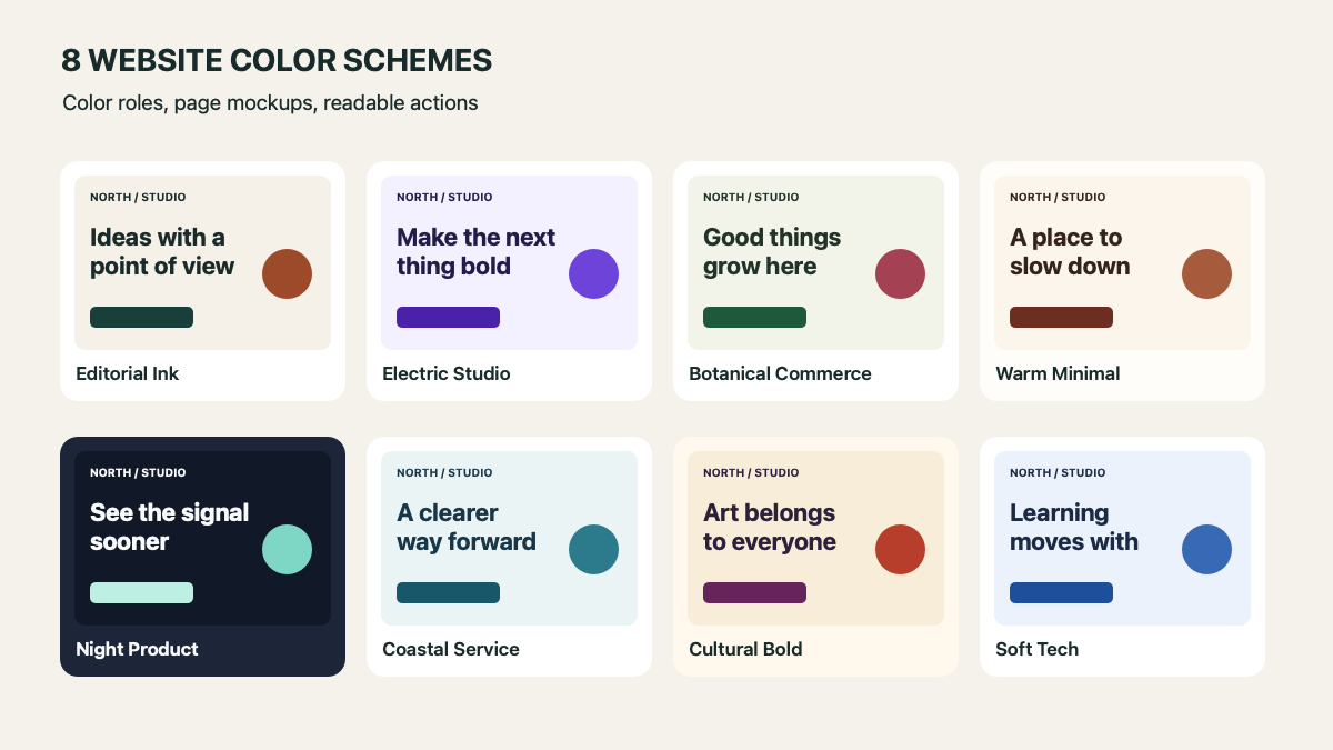
The best website color schemes do more than look good as five swatches. They make a headline easy to read, keep the next action visible, and leave room for real content. The eight original page mockups below show each palette in context, with exact hex values you can adapt.
These are fictional “North / Studio” layouts, not screenshots of client websites. Each example uses one background, surface, text, accent, and action color. The text and button pairs were checked against WCAG contrast ratios; that is a starting point for review, not an accessibility certification for a finished site.
Eight website color palettes at a glance
Start with the job of the page. Editorial pages can stay quiet around imagery; shops need product clarity; software interfaces need actions that stand out through repeated use. Then test the chosen colors on a real layout instead of approving a swatch board alone.
1. Editorial Ink — Editorial and portfolio
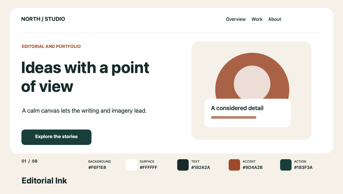
Best for a portfolio or magazine that needs a quiet frame around strong photography. The deep green action is distinct from the warm accent, so links and buttons do not have to borrow the same color.
2. Electric Studio — Creative studio
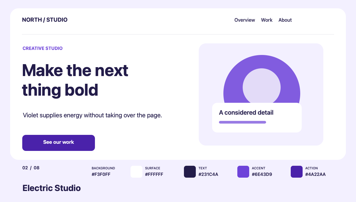
Best for a creative studio that wants a confident first impression. Put the violet in highlights and controls; the pale field gives project images space to compete for attention.
3. Botanical Commerce — Natural product shop
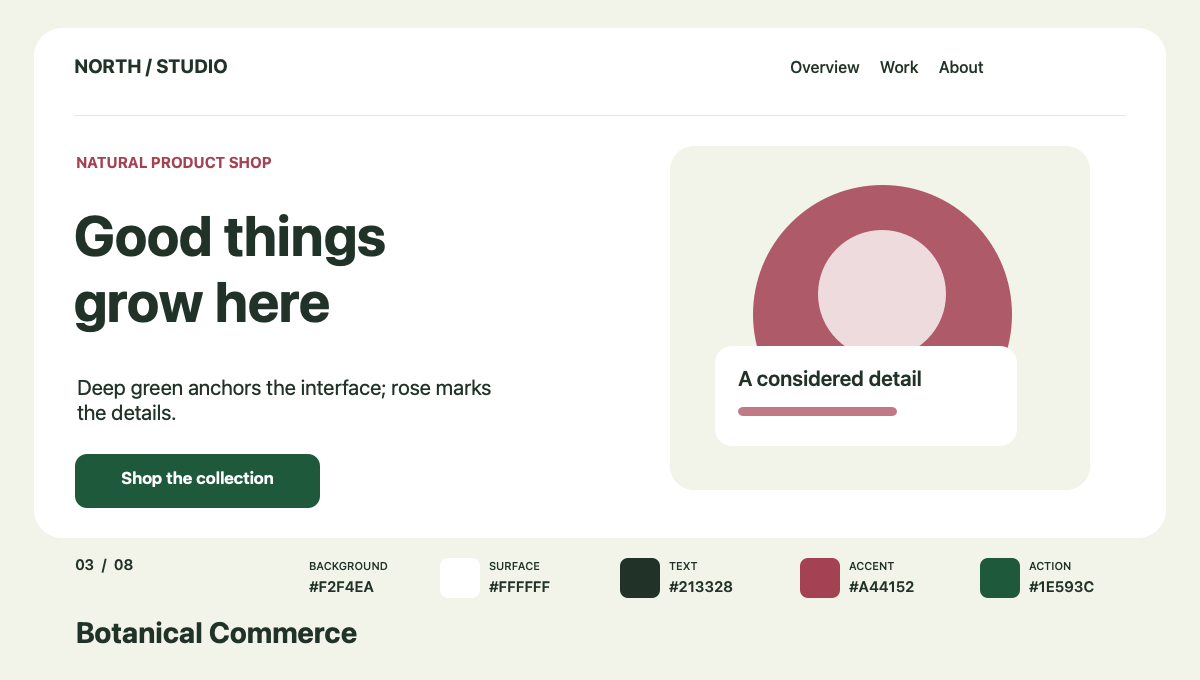
Best for a natural product store. Green can carry the main action while rose marks editorial moments such as a collection label. Keep product photos accurate; a palette should support the merchandise.
4. Warm Minimal — Hospitality and lifestyle
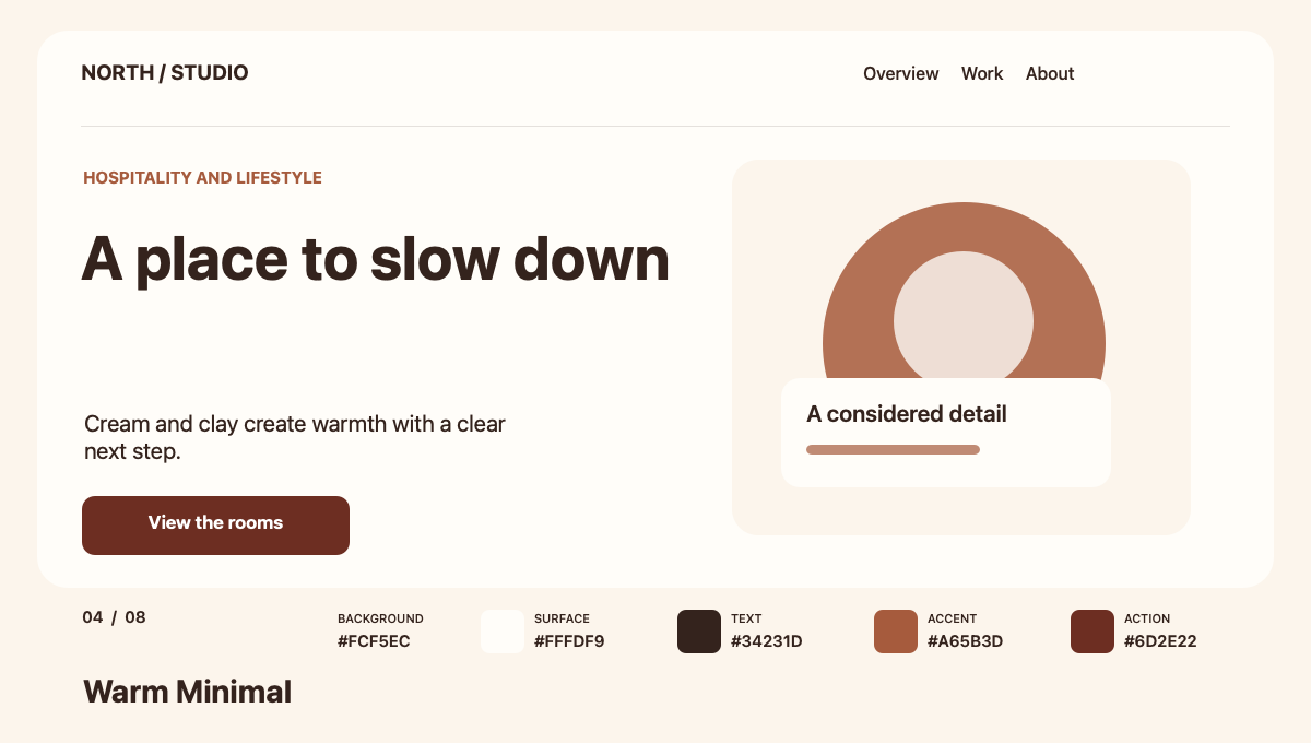
Best for hospitality, food, or a lifestyle brand. Cream and clay feel warm, but the dark brown text is what makes the page easy to scan. Check photography and pricing against the actual background.
5. Night Product — Software product
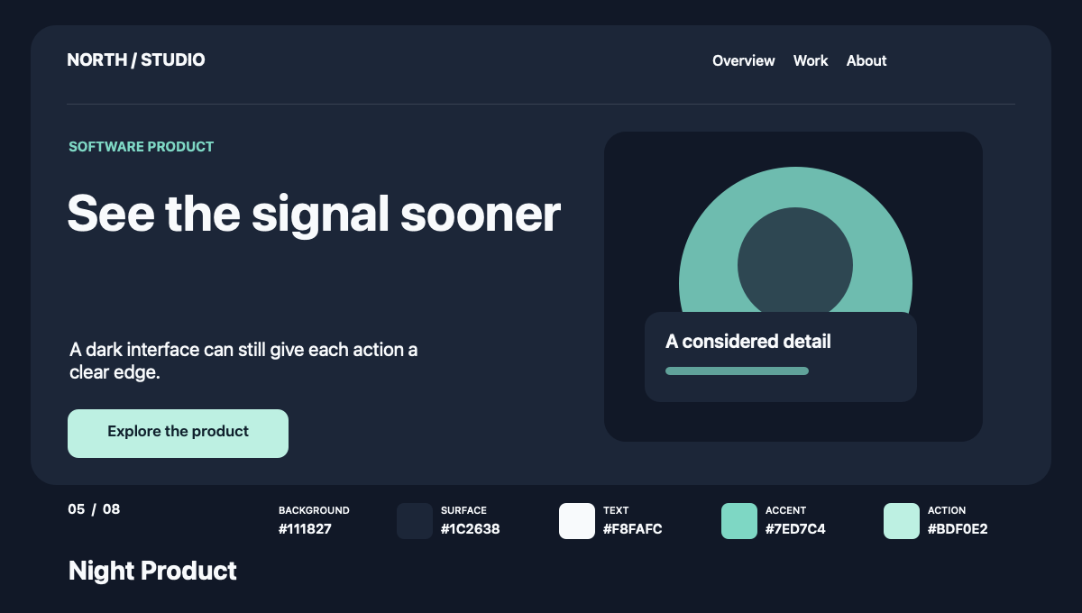
Best for a data or software interface. Mint gives the primary action a clear edge on a dark surface. Use the same contrast discipline for charts, status colors, and focus indicators.
6. Coastal Service — Professional service
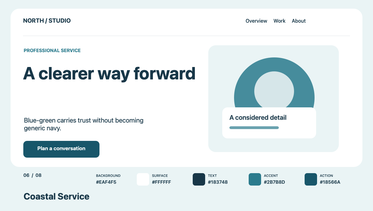
Best for a professional service with a measured tone. Blue-green brings a little character to a familiar trust palette. Keep calls to action concrete so the muted field does not flatten the offer.
7. Cultural Bold — Arts and events
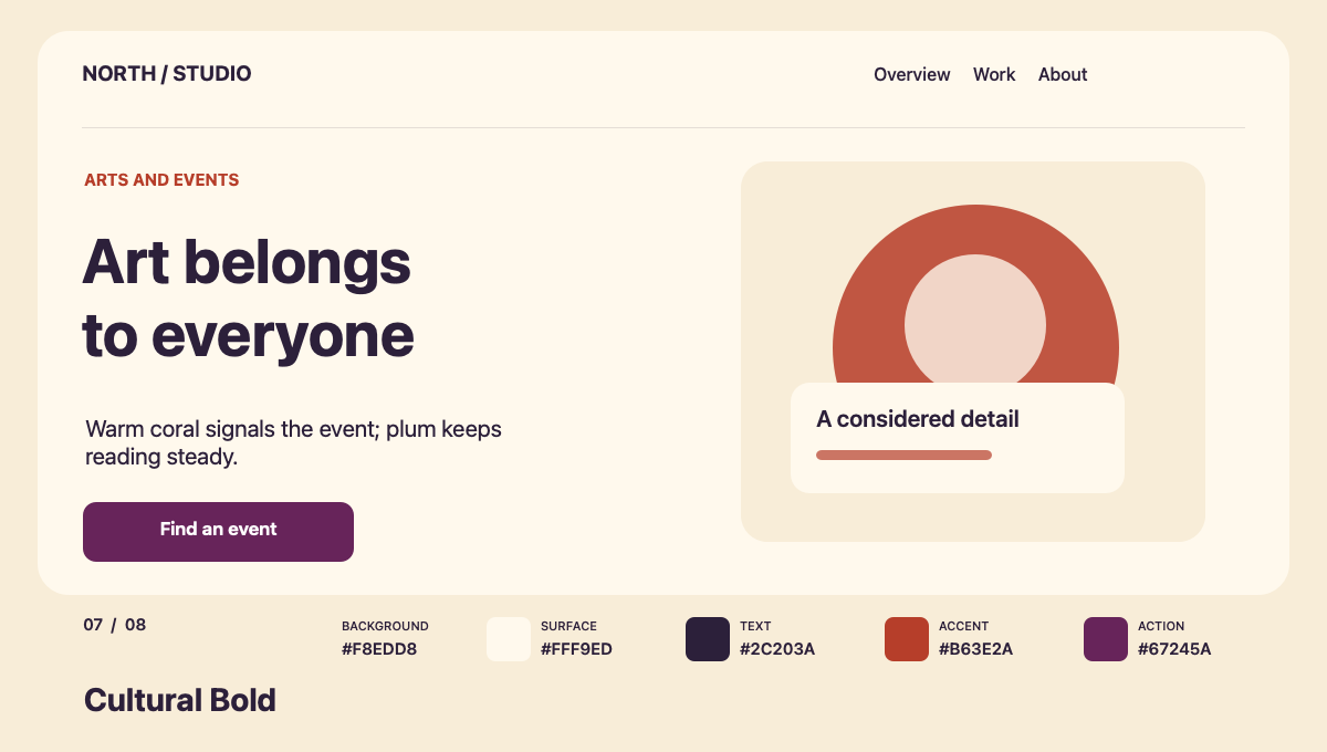
Best for an arts organization or event page. Coral can signal energy in artwork and labels, while plum holds the navigation and action. Event information still needs a plain, readable hierarchy.
8. Soft Tech — Education technology
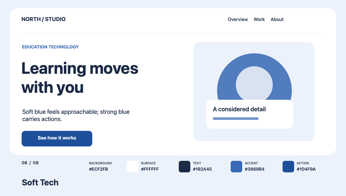
Best for education or a friendly technology product. The light field lowers visual weight and the stronger blue identifies actions. Do not rely on blue alone to distinguish links from surrounding text.
How to choose a color scheme for a website
First, decide what visitors must notice: the offer, the work, the product, or the next step. Assign a job to each color instead of adding shades until the page feels full. Put the palette into a mobile header, hero, card, form, and button before committing to it.
Next, check the actual color pairs. WCAG 2.2 AA calls for at least 4.5:1 for normal text and 3:1 for large text. Visual cues needed to identify controls and meaningful graphics generally need 3:1 non-text contrast. Our eight mockups have body text on their surface above 12:1 and button labels on their action colors above 7:1. Accent colors are not automatically safe for every text size or background.
Finally, test hover, focus, disabled, and error states. A color palette cannot carry meaning by itself: use labels, icons, or patterns where the meaning matters. Review the page in daylight, on a phone, and with real photography before approving the system.
CSS color tokens you can adapt
Store roles instead of scattering hex values through components. Here is the Editorial Ink palette; replace the values with any of the sets above, then test every component state again.
:root {
  --color-background: #F6F1E8;
  --color-surface: #FFFFFF;
  --color-text: #182A2A;
  --color-accent: #9D4A2B;
  --color-action: #183F3A;
  --color-action-text: #FFFFFF;
}

body { background: var(--color-background); color: var(--color-text); }
.card { background: var(--color-surface); }
.button { background: var(--color-action); color: var(--color-action-text); }
What is the best color scheme for a website?
The best scheme fits the brand, helps people read, and makes the primary action obvious. For a content-heavy site, begin with Editorial Ink or Warm Minimal. For a product interface, try Night Product or Soft Tech. Keep the names as starting points; the real decision comes from testing your own content and components.
If your team is translating a visual direction into a maintainable site, see Interactive Blend’s work and our custom WordPress development. The point is to carry the chosen color roles through templates, content, and interactions instead of leaving them in a mood board.