
8 Animated Websites Worth Studying in 2026
Animated websites give people a reason to keep exploring when motion has a clear purpose. A transition can show where they are, a moving object can make a complex idea tangible, and a small visual response can confirm that an action worked. When motion only adds spectacle, it can slow a visitor down.
These eight animated websites and web experiences illustrate different jobs motion can do. The linked destinations and their creators’ descriptions were checked in October 2026. Some launched earlier; this is a current reading list, not a list of sites released in 2026. The usability checks below are questions to ask when adapting each idea; they are not full accessibility audits of these sites.
1. Splash Canvas: Make participation the main event
In Splash Canvas, visitors drag sea creatures across a digital canvas to paint. Google Arts & Culture describes a fluid simulation, character dialogue, and procedural audio. The movement is the activity itself: painting would lose much of its meaning if the brush left no visible trail. Lesson: When interaction is the product, let animation show cause and effect immediately. Usability check: Give people a clear way to manage sound and an alternative when sustained movement is uncomfortable.
2. The Talking Museum: Let movement reveal detail
The Talking Museum lets visitors bring cultural artifacts into a virtual study room, rotate them, zoom in, and discover hotspots on selected objects. Its motion supports a specific question: what is worth noticing on this object? The interaction is more useful than a decorative spin because it leads to information. Lesson: Use movement to connect a visual detail with its explanation. Usability check: Make important descriptions discoverable without requiring precise dragging or a particular input device.
3. Firefly Children’s Foundation: Turn history into a browsable story
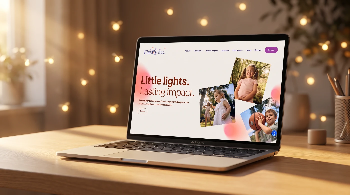
Firefly Children’s Foundation uses an interactive history timeline and horizontal scrolling sections, as the developer’s case study explains. The site also keeps donation, fundraising, volunteering, and grant routes visible. That matters: a compelling story should help a visitor understand the organization without hiding the next practical step. Lesson: Put motion around meaningful milestones, then keep key actions easy to find. Usability check: Read the timeline on a narrow screen and with reduced motion enabled; the chronology should still make sense.
4. Chubb Bulleid: Keep a service journey calm
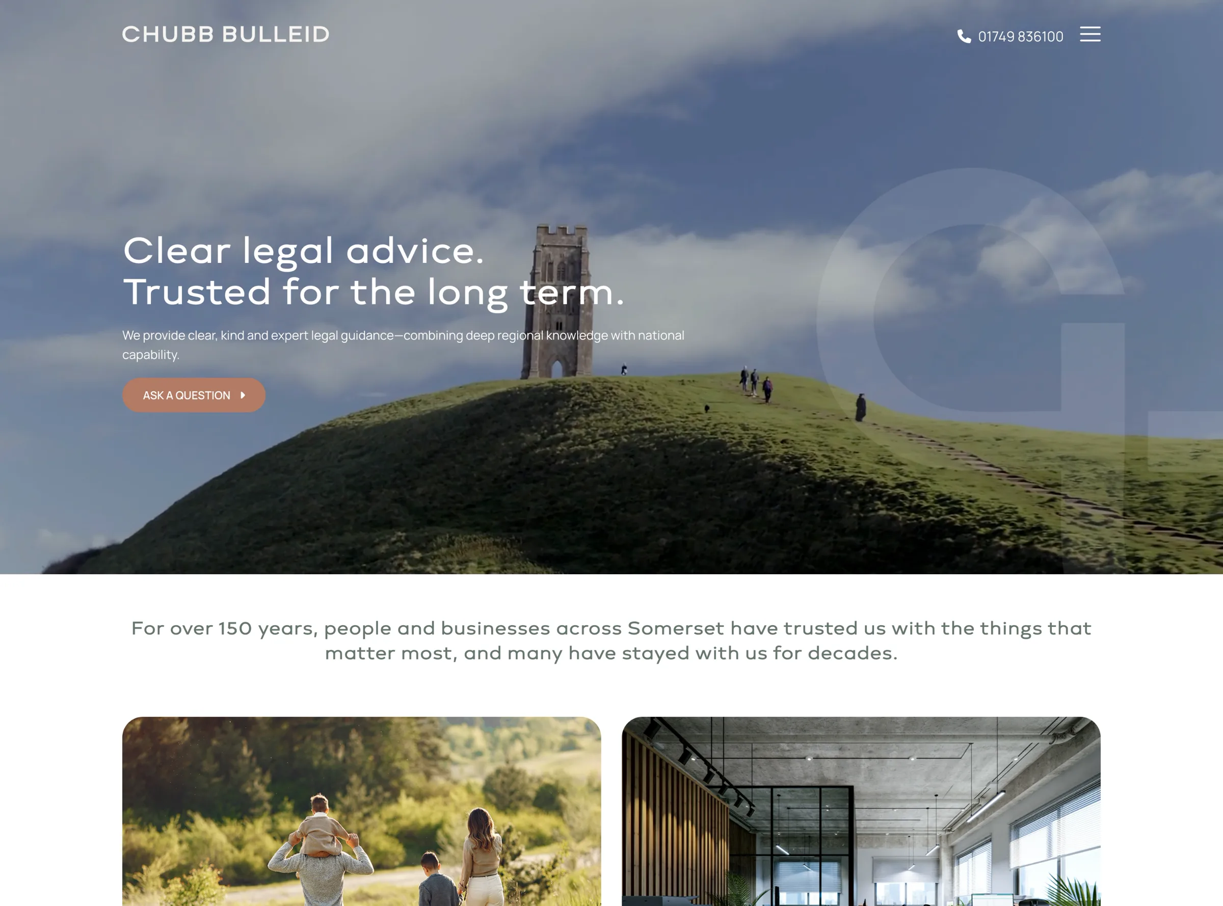
The Chubb Bulleid site opens with aerial footage and divides its legal services into “For you” and “For your business.” Its design team describes smooth on-scroll animation, but the service choices and “Ask a question” route remain the main event. For visitors facing a serious legal matter, that restraint fits the task. Lesson: Match the pace of motion to the visitor’s situation. Usability check: Ensure the opening footage never blocks the headline or contact path, especially on mobile.
5. DataMorph: Show technical craft through the interface
DataMorph uses scroll reveals and a cursor-responsive dot field on its portfolio. In the maker’s write-up, the site itself is treated as a project: the motion demonstrates the same engineering judgment offered to clients. The maker says the canvas simulation does not run when a visitor prefers reduced motion. Lesson: A portfolio can demonstrate a capability in the experience, not just claim it in the copy. Usability check: Confirm the work and contact routes stay obvious when the animation is absent.
6. Meet A: Give a brand character a real job
On Yassine Amraoui’s portfolio, the yellow “A” from his logo becomes a guide through projects and a recurring visual cue. His creator case study explains how the character appears in different contexts and handles page transitions. The animation makes the creator’s work memorable while tying back to the brand. Lesson: A recurring animated element works best when it helps orient visitors. Usability check: Keep the underlying text and navigation usable when the character is still or unavailable.
7. Interland: Use an animated world to teach
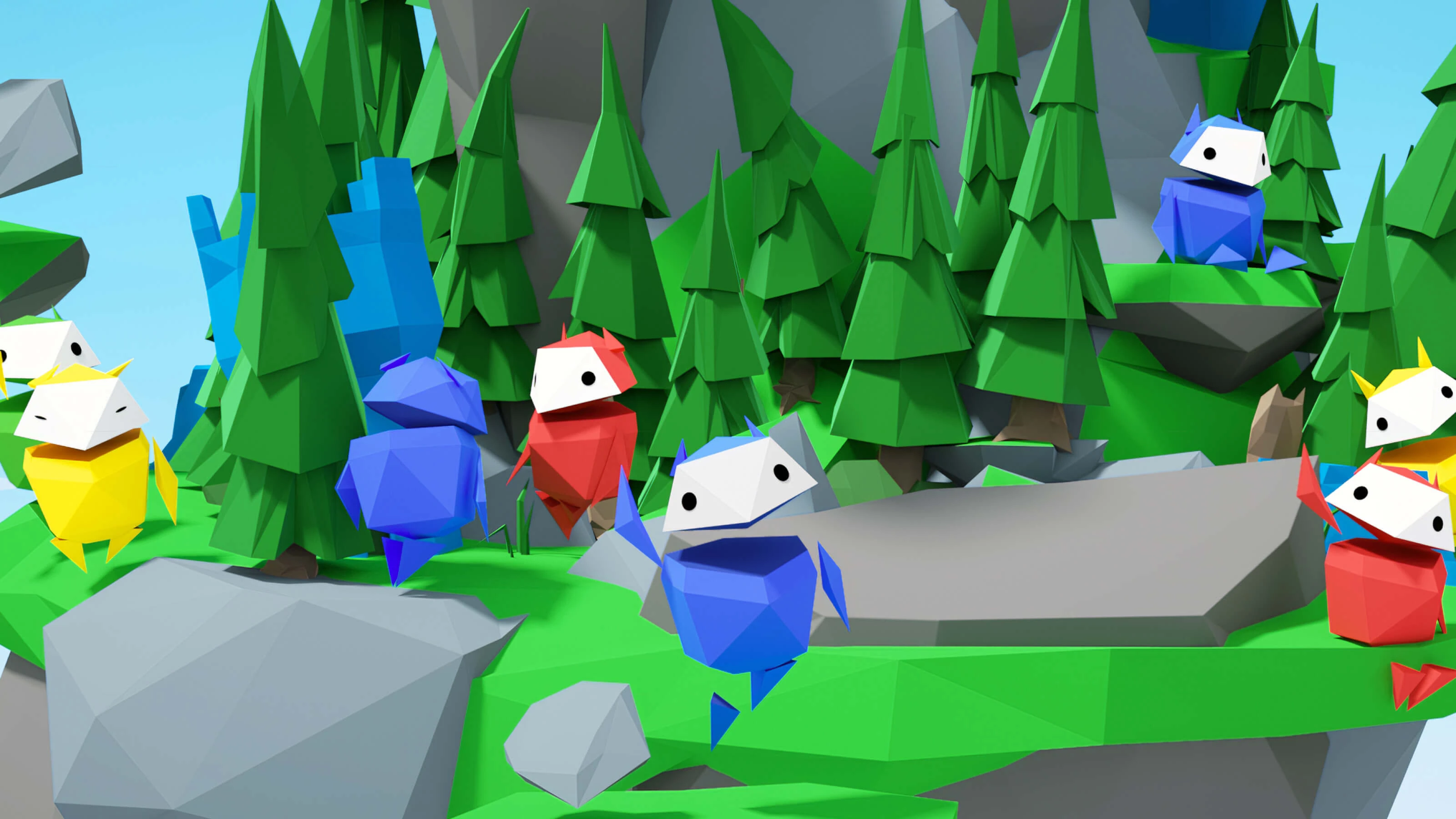
Interland is an older Google learning game that remains a useful reference. Its four areas turn online safety topics into tasks children can play through. The technology partner’s case study describes an immersive 3D world built for that educational purpose. Lesson: Animation earns its place when it lets people practice a concept, not merely watch an explanation. Usability check: Pair game progress with clear instructions and a way to review the lessons outside the action.
8. Wook Water: Add personality without obscuring shopping
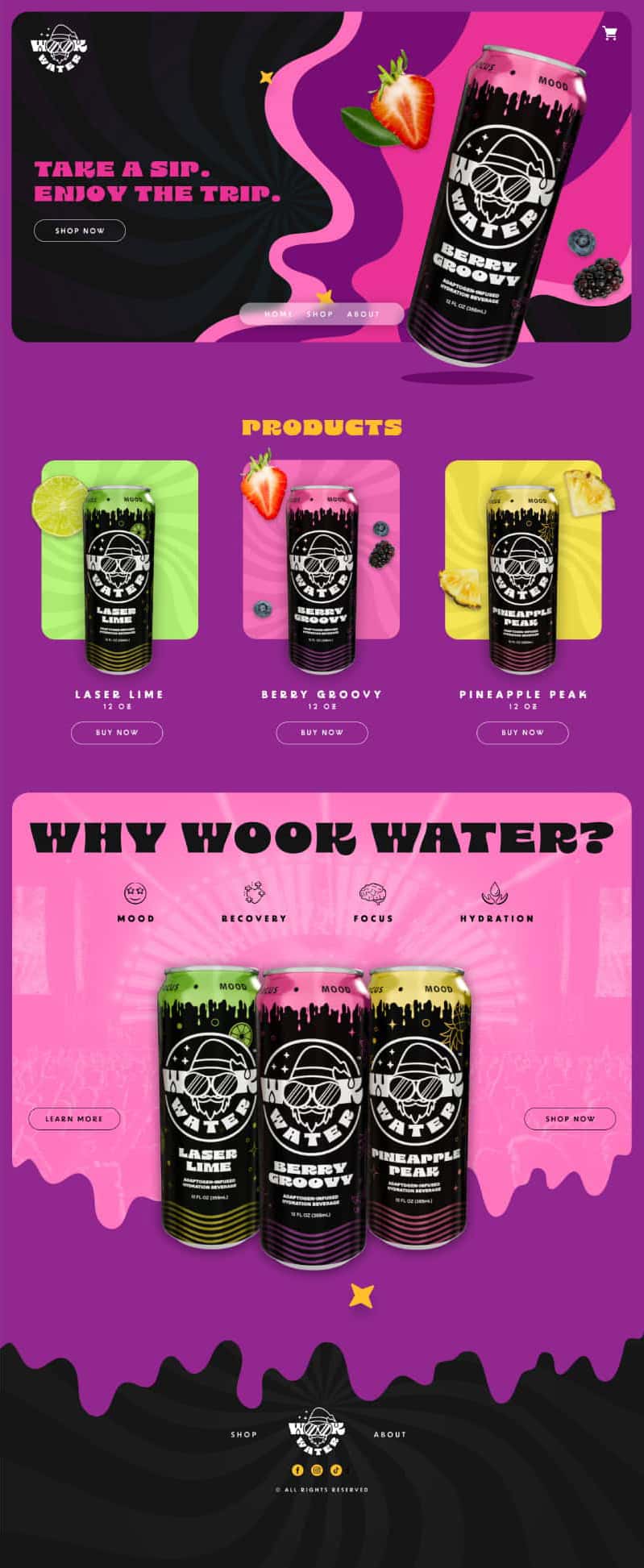
The Wook Water shop uses bright graphics and movement to express its playful brand. The creator’s case study describes scroll-based micro-animations, floating elements, and animated characters around an online store. The useful idea is scale: small moments can establish a mood while products, navigation, and the cart remain the reason people came. Lesson: Make brand motion support product discovery. Usability check: On a phone, verify that animation does not delay product details or cover purchase controls.
What these animated websites have in common
They give movement a specific job: invite participation, reveal information, organize a story, explain a service, demonstrate skill, teach a lesson, or add personality. Before borrowing a pattern, describe what the visitor should understand or do after it plays. Then check the same page with a keyboard, on a small screen, and with reduced motion enabled. The W3C guidance on moving content is a useful starting point for deciding when motion needs a pause or stop control.
For a closer look at the tools behind interactive motion, compare Rive, Jitter, and Spline for web projects.
Have an idea that would be clearer in motion? Interactive Blend creates motion assets for web experiences and digital campaigns. Start with the message the movement needs to carry; the effect can follow.