
7 Service Landing Page Design Examples Explained
A service landing page has a harder job than a product page. The visitor cannot inspect the finished work before buying it. They need to understand who the service is for, what they will receive, why they should trust the provider, and what happens after they click.
The seven live pages below answer those questions in different ways. They are useful service landing page design examples because each makes a particular decision visible. Study the pattern, then adapt it to your offer rather than copying the page.
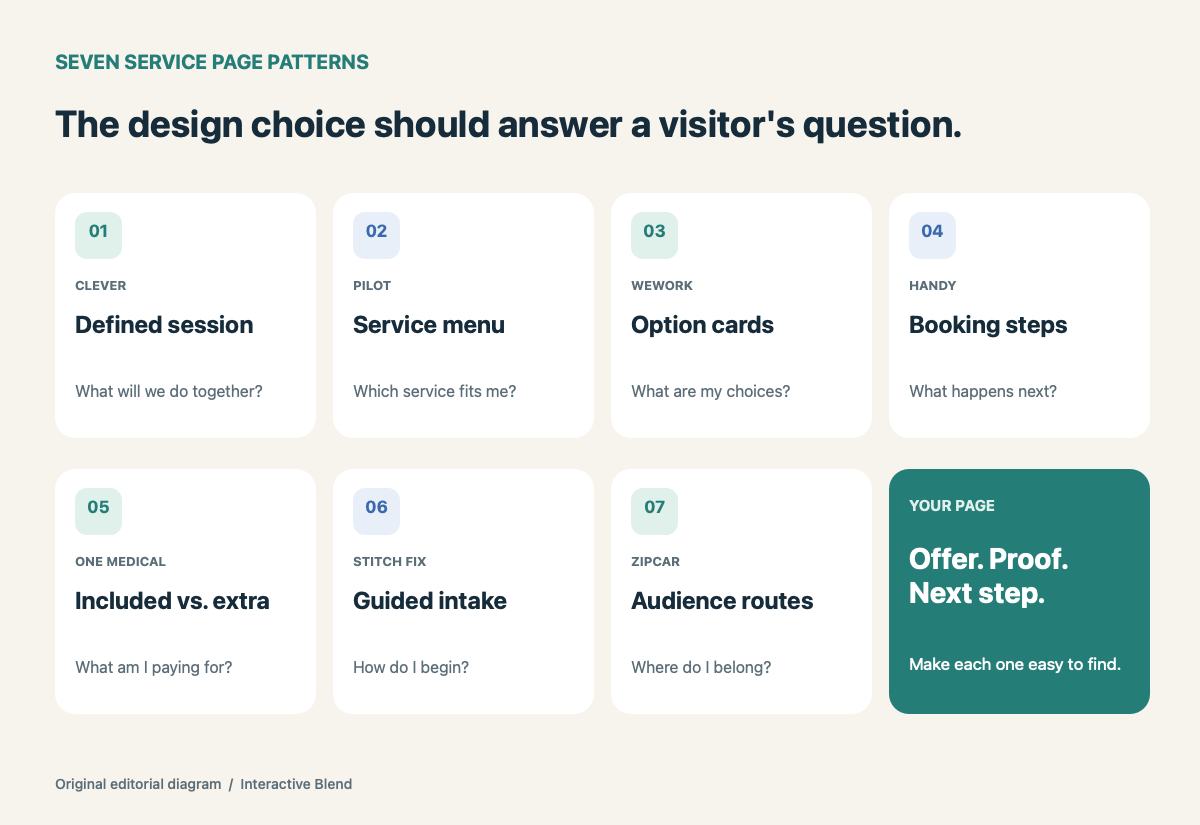
Seven ways to make a service easier to understand. Original Interactive Blend diagram.
1. Clever turns consulting into a defined session
Clever’s consulting page speaks to school districts that already use its platform. Instead of offering vague “expert support,” it names the work: a planning call, a customized 90-minute session with a specialist, and help with technical issues. It also introduces the consultants and describes the kinds of projects they handle.
What to borrow: Give a service a visible shape. List the stages, the people involved, and what the client leaves with. “Book a consultation” becomes less abstract when the page explains the meeting itself. Clever can assume readers know its product; a less familiar provider may need to explain the underlying service earlier.
2. Pilot organizes a broad offer into clear service lines
Small-business accounting can mean several things. Pilot’s small-business page separates bookkeeping, tax, and accounts payable and payroll services, with a short explanation and a route to learn more about each. Named customer testimonials appear beneath those options.
What to borrow: If clients use one broad term for several jobs, show the parts. A visitor can find the relevant service without decoding an all-purpose promise. Put proof close enough to the offer that readers can connect a claim with a real customer or project. Do not turn a testimonial into a general performance guarantee.
3. WeWork lets visitors compare booking options
WeWork On Demand starts with a precise unit of purchase: workspace by the hour or day. Its cards distinguish a coworking day pass, a meeting room, and a daily private office. Each explains how the space is booked and what is included; the page then walks through finding a location, booking, and arriving.
What to borrow: When a service has tiers or formats, make the differences scannable before asking for a commitment. Use the units customers actually compare: duration, capacity, deliverables, and access. The three-step process also answers a quiet question behind many CTAs: “What happens next?”
4. Handy shows the booking sequence
The Handy home-cleaning page frames the service around booking a specific job. It presents trust cues and then describes a simple sequence: choose a time, book, and meet the professional. The page names practical concerns such as pricing and scheduling instead of relying only on lifestyle photography.
What to borrow: For appointment-based services, show the path from interest to arrival. A useful page can answer who comes, when they come, and what the customer must do first. If your own process varies by location or job type, say so before the booking action rather than implying every appointment works identically.
5. One Medical separates membership from visit costs
On its personal membership page, One Medical distinguishes services included with membership from scheduled visits where insurance billing, copays, or fees may apply. The page gives visitors a way to examine what the membership covers before signing up.
What to borrow: Make exclusions and extra charges visible alongside benefits. This is especially valuable when a recurring fee is easy to mistake for an all-inclusive service. A comparison table or plainly labeled groups can do more for clarity than a long paragraph of qualifications. Keep the details current as pricing and coverage change.
6. Stitch Fix makes the first action feel like the service
The Stitch Fix women’s page asks visitors to take a style quiz, then explains the sequence: share style, size, and budget; get matched with a stylist; receive a box. The action is specific and connected to the personalization the service promises. The page also states that no subscription is required and that shipping and returns are free.
What to borrow: A CTA can start the service experience rather than merely open a generic contact form. If you need information to tailor an estimate or recommendation, a short guided intake may be more meaningful than “Submit.” Explain what the visitor will be asked and what they receive afterward.
7. Zipcar gives business buyers a route by need
Zipcar for Business presents the shared offer, then routes visitors to residential, small-business, enterprise, and government solutions. It also names account-level details such as billing and administrative controls before asking readers to contact sales.
What to borrow: A single service can serve several buyer types without forcing everyone through the same sales story. Start with the common value, then let visitors choose a route that matches their organization. Segment only where the offer or buying process actually differs; extra paths can make a simple service harder to understand.
A four-question test for your own page
These examples use different layouts, but the same four questions can guide a first draft:
- Who is this for? Name the customer or situation in the opening screen.
- What is included? Show the service, deliverables, boundaries, and any meaningful choices.
- Why believe it? Use relevant projects, named testimonials, credentials, or a clear account of the process.
- What happens next? Make the CTA specific, then explain the next step it starts.
Read the page on a phone and ask someone unfamiliar with the business to answer those questions. Note where they hesitate. Our homepage clarity checklist offers a related five-second exercise for the front door of a site. If the content is clear but difficult for your team to maintain, see how we approach custom WordPress development with flexible editing tools.